


Logo Glow Ups: How EV and Hybrid Versions Changed Classic Badges
Electric car logo updates are real, and EV and hybrid versions have changed classic badges in a way you can spot fast. The old rule was deep chrome and high contrast, because brands wanted the logo to pop in sunlight. The new rule is clean reading on screens, calmer surfaces on the car, and fewer extra cues that confuse buyers. This title holds up because electrification forced brands to simplify, and that same simplification shows up clearly on modern wheel centers.
Hybrids started the shift because brands wanted a quick cue that said “efficient” without redesigning the whole car. Blue accent car badges became the shortcut, and customers learned the signal over time. Now that hybrids are normal, brands are dialing it back instead of pushing it harder. Toyota has confirmed it is phasing out its blue halo hybrid emblem and moving to other electrification cues like a small blue dot and HEV lettering.
EVs accelerated the cleanup because modern buyers see cars through apps, photos, and screens. A busy 3D badge that looks fine in person can look muddy on a phone, especially in low light. Brands also learned that too many EV sub brands add friction at the point of sale. That is why you now see a move from “special EV family” back to “the same lineup, now with electric versions.”
Why electrification forced badge redesigns
Three forces show up again and again when you look at modern badge decisions, and they are practical. First, a badge has to render sharply on small digital surfaces where chrome shadows turn into blur. Second, electrified models often share body panels with gas models, so the badge becomes the fastest way to signal “this is the electrified one.” Third, customers hate confusion, so brands are simplifying names and cues instead of adding layers.
You can spot the common moves quickly once you know what to look for. These are small changes that add up to a cleaner look in real life and in photos. They also transfer well to wheel centers because wheels are high contrast surfaces. Copy the move, not the hype, and the result looks more factory.
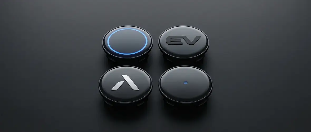
Colored accents shrink from a big ring to a thin ring, a dot, or a subtle outline.
Logos lose inner chrome and heavy bevels so they photograph cleanly.
Extra words get smaller or disappear because the powertrain story is already understood.
Model names lean back toward familiar words because real names beat codes when people shop fast.
On wheels, that design logic matters even more because spokes create harsh highlights and reflections distort busy shapes. Brake dust also makes chrome look tired fast, so calmer finishes tend to age better. A restrained emblem stays readable and makes the wheel look intentional. That is why ev style wheel emblems usually look flatter and darker than older chrome era caps.
The blue accent era and what replaces it
Blue accents worked because they were easy to understand in one second. Toyota’s blue halo emblem became a widely recognized hybrid cue, which is why Toyota moving away from it is a useful signal for the whole market. When Toyota says the blue halo is being phased out, it tells you the “big blue ring” hybrid era is fading. The replacement is restraint, not a new loud color.
If you want blue on your wheel emblems without looking dated, treat it like one highlight. Use black and silver as the base, then add one small blue cue if your car already uses blue somewhere else. Keep the blue thin so the logo still reads as the main element. This approach also works on plug in hybrids that want a modern, calm look.
Follow these rules and you will keep the accent current. The goal is an OEM style signal, not a neon announcement. Keep the accent small so the emblem reads cleanly from standing height. Let the wheel design do the rest of the work.
Pair blue with satin gray, brushed silver, and black trim.
Keep blue to a thin ring or a small dot, not a thick border.
Skip extra blue valve caps unless the car has factory blue accents in several places.
If your car has no blue accents at all, stick to black and silver.
EV naming and badging are simplifying again
The newest badge story is not only color, it is also naming. Mercedes has been moving away from a separate EQ identity, and Car and Driver described the G 580 with EQ Technology as part of that transition away from pure EQ model names. The goal is to tie electric models back to familiar core names so customers do not feel lost. That makes the badging feel more normal and less like a side brand.
Volkswagen has taken a similar path toward familiarity. Volkswagen Group published a naming strategy stating it will transfer established bestseller names to the ID models, and Reuters covered the plan in the context of pricing and competition. That means the big badge can be a name buyers already know, with “ID” becoming a smaller marker. It is a clear signal that the market is rewarding simpler identity cues.
Volvo is also simplifying what you see on the tailgate. Volvo announced it is renaming the XC40 Recharge and C40 Recharge to EX40 and EC40 to make its electric lineup easier to understand. That change affects the badges and the way customers read the car at a glance. Toyota has also shortened its EV naming, renaming the bZ4X to bZ for the 2026 model year, which reinforces the same direction toward simpler identity.
Flat and minimal physical badges are now mainstream
Many badge changes are subtle, but they add up quickly when you see them on the road. BMW is a good example because it protects heritage elements, yet it still nudges the physical badge toward a more minimal look. Creative Bloq reported that BMW introduced a subtle roundel tweak seen on the iX3, removing chrome accents from parts of the badge. That is a quiet “glow up,” but it shows where physical emblems are heading.
Brands also justify the flat look directly when they talk about logo systems. Skoda explained that a simplified two dimensional logo is more effective on mobile devices and easier to integrate across formats. Even if the car still wears a physical badge, the graphic language is now flat first, and the physical parts follow. That is why hybrid logo stickers and wheel emblems look better when they avoid extra shadows and overly complex depth.
How to match wheel emblems to modern badge language
The goal is consistency from grille badge to rear badge to wheel centers, because your eye reads the whole car as one design. If the car’s badging is calm and minimal but the wheels are loud and shiny, you see a mismatch right away. If everything reads like one system, the car looks newer even if it is not. That is the same logic brands are using when they simplify badge systems.
Start with three choices: finish, accent, and profile, and decide them in that order. Finish is black, silver, chrome, or satin, and it should match your window trim and grille badge. Accent is one small color cue at most, usually blue on hybrids, and it should match factory details. Profile is flat versus domed, and it should match the wheel face and the rest of the car’s styling.
To compare styles quickly, check Wheel Emblems for clean standard looks, then compare it to Domed Emblems for glossy depth. If your exterior badges look flat and calm, a flatter wheel emblem usually fits best. If your wheels want a premium center anchor, a dome can look more factory.
The OEM look comes from sizing and alignment
The biggest quality giveaway is not the logo design, it is the edge and the alignment. If an emblem is even slightly oversized, it overhangs the flat target circle and the edge becomes the first failure point. If the emblem is rotated, your eye catches it because logos have strong symmetry cues. A clean install looks boring, and boring is what OEM looks like.
Use this checklist and you will avoid most problems. Measure the flat target circle on the center cap in millimeters, not the outer cap diameter. Clean with a degreaser and finish with isopropyl alcohol so the adhesive bonds to the surface. Do a dry fit and check level from standing height, then press from the center outward and let it cure before washing.
Measure first and confirm the surface is flat where the emblem will sit.
Clean twice, because the last invisible film ruins adhesion.
Align from standing height, then press from the center outward with firm pressure.
Avoid wheel acid cleaners on the edges during the first days after install.
If you want the basics explained without fluff, this guide is a good starting point: What Are Wheel Emblem Stickers and How Do They Work?. It will also help you avoid sizing mistakes that cause edge lift. Read it once, then order with confidence, and you will waste fewer stickers.
When domed emblems still make sense on hybrids and EVs
Flat and minimal is popular, but domed emblems still win on certain wheels and certain cars. A good dome adds contrast and catches light, which helps the center cap read cleanly on dark wheels. It also gives a premium “finished” feel on complex spoke designs that need a strong center anchor. On some cars, the dome is the detail that makes the wheel look complete.
Domed emblems are a strong match in these cases. Luxury hybrids and EVs with complex wheels benefit from a center that does not disappear in shadow. Deep spoke wheels often need extra depth at the cap to stay visible at a distance. Premium finishes like satin paint and gloss trim also pair naturally with a glossy dome.
Luxury hybrids and EVs where the wheel design is complex and you want a readable center.
Wheels with deep shadows where a flat emblem disappears at a distance.
Builds that already use premium finishes like satin paint or gloss trim.
Drivers who want a thicker, more tactile look that stays crisp in photos.
If you want a clear example of the glossy premium style, see: Wheel Emblems Premium Design Domed Stickers Pro. Use it as a reference for what “premium center” looks like on a modern wheel. Compare that look to a flatter emblem and pick the one that matches your car’s exterior badging.
A small add on that supports the badge look
Once the center caps look right, the only other wheel detail worth matching is the valve cap. Valve caps repeat four times, so they amplify either a clean look or a messy one. Keep them simple and match the emblem color, not a random accent the car does not have. Browse Valve caps for fit and finishes, or use a basic alloy option like Valve Stem Caps Car Professional Build Style.
What not to do when copying modern badge cues
Most mistakes come from trying to do too much at once, and modern badging is restraint. If you keep it simple, you get the “factory” look people want and you avoid clashes. If you over decorate, you get a wheel that looks like a parts catalog. Keep your edits aligned with the clean, calm direction brands are choosing.
Avoid these common errors. Do not mix warm chrome with cool black and blue unless the rest of the car already mixes those finishes. Do not use multiple different silvers across wheels, grille, and rear badge because the mismatch reads cheap. Do not apply a sticker on a curved or dirty surface because edges lift quickly.
For a companion read on how people interpret wheel emblems, see: Hybrids vs EVs: 10 Myths (and What Your Wheel Emblems Secretly Say About You). It connects the powertrain talk to what people notice about your wheels. It also gives you a practical way to think about the “signals” your badges send.
Final takeaways
Electrification pushed brands toward simpler identity, and the newest badge decisions support that direction. Toyota is phasing out the blue halo hybrid emblem, Volvo is simplifying Recharge naming, Volkswagen is transferring familiar names to its EV lineup, and BMW is flattening details on its roundel. Those moves point in the same direction: calmer badges, clearer names, and fewer “special” cues. Copy that logic on your wheels and your car looks current without trying too hard.
Quick Q and A
Q: Are blue accent car badges still correct on new hybrids?
Yes, but the big blue halo look is fading, and Toyota has confirmed it is phasing out that emblem on hybrids. If your car still uses blue in factory cues, keep the wheel accent thin and controlled so it reads current.
Q: Why are brands walking back EV family names like EQ and ID?
Because buyers remember familiar names and get tired of codes. Volkswagen has published a strategy to transfer established names to its EV lineup, and Mercedes has been moving away from a separate EQ badge strategy toward more familiar naming.
Q: Should an EV always use a flat wheel emblem?
No, it depends on the wheel design and the trim language of the car. Flat emblems suit tech minimal cars and aero wheels, while domed emblems can look right on premium wheels that want depth. Pick the style that matches your car’s overall badge language.
Q: What is the fastest path to an OEM looking wheel center?
Measure the flat target circle in millimeters, clean properly, and align from standing height before you press down. Most “cheap looking” installs are alignment or edge lift problems, not a bad design. Slow down and treat the install like a detail job.
Q: Can I mix black wheel emblems with chrome exterior badges?
Yes, if the car already has black trim elements like window surrounds or mirror caps. If the rest of the car is bright chrome, match the wheel emblem to that chrome so the car reads consistent. Consistency matters more than “cool.”
Q: My center cap size is between two options, what should I do?
Choose the smaller size so it stays fully on the flat surface and the edges do not overhang. A tiny gap looks clean, but an overhang catches wash brushes and airflow and it lifts. If you are unsure, measure again before you commit.


