


The $20 Wheel Upgrade. Before and After.
Car mods do not get simpler than this, the $20 wheel upgrade gives you a clean before and after because it refreshes the center cap, the one spot your eye hits first. I was standing in my driveway looking at a car that ran great, yet still looked tired from ten feet away. The paint was fine and the tires were fine, but the wheel centers looked washed out and scratched like they had been sandblasted by life. The title The $20 Wheel Upgrade. Before and After sounds like hype, but the change is real when you fix the focal point.
A friend rolled up last week and asked why his car never looked sharp in photos, even right after a wash. I walked him around the car and told him to stare at the middle of each wheel, not the spokes. Two caps were faded to a grayish mess, and one cap had a missing valve cap that screamed “I do not care,” even though he did. He had been shopping wheels online, ready to spend real money, and the funniest part is his wheels were not the problem.
Here is the part nobody wants to hear, wheels usually look bad for small reasons. Brake dust cakes into corners, plastic gets hazy, and the logo becomes the weakest link. Your brain reads that logo as the identity of the wheel, so when it looks dead the whole wheel looks dead. That is why cheap car customization works best when it targets the focal point, not the biggest part.
I like this upgrade because it respects your wallet and your time. A lot of shops quote powder coating four wheels in the hundreds of dollars, often around $400 to $800 depending on size and finish. Basic rim repair is also usually priced per wheel, so even small fixes stack up fast when you multiply by four. A set of decals and a little prep is the kind of move that lets you test a new look before you spend real money.
Why the center cap is the cheat code
The center cap is the face of the wheel, and it controls the whole vibe. If the center looks clean, the wheel looks newer, even if the spokes have a few scars. If the center looks faded, the wheel looks cheap, even if the wheel is expensive. That is why I treat the center like the front door of a house, it is not the whole building, but it is what people notice first.
Most factory center caps fade in a boring way, sun and road grime just beat them up. Plastic gets hazy, the printed logo loses contrast, and little scratches catch light. You cannot polish printing back into existence, and you should not have to buy new caps for a logo problem. A domed emblem fixes that fast, because it gives you fresh color plus a glossy surface that makes the center look like a new part.
Here is what I look for when I want the “badge” look, not the “sticker” look. The cap face needs to be smooth and mostly flat so the adhesive can bite. The emblem needs to have strong contrast, because tiny details disappear from a few steps away. And the finish should match the car, so the upgrade looks planned instead of random.
Smooth, flat cap face for full contact
Bold logo with clear edges
Finish that matches your wheels or trim
The $20 plan that actually works
I keep this plan boring on purpose, because boring plans get finished. You do not need tools, a jack, or a weekend, you need soap, alcohol, and patience. The goal is one clean before and after photo, same angle, same light, no excuses. When you do it right, it looks like you replaced parts, even though you did not.
This is the order I follow, and I do not mess with it. Clean first so you are not grinding grit into the cap. Degrease next so the adhesive is touching plastic, not road film. Install last and press hard, because pressure is what wakes up the adhesive.
Wash the wheel center and rinse well
Dry fully with a clean towel
Wipe the logo area with isopropyl alcohol and let it air dry
Test the emblem position before peeling anything
Apply and press from center out for at least thirty seconds
That alcohol wipe is the line between “it sticks” and “it flies off.” Many decal install guides recommend finishing prep with an isopropyl alcohol wipe to remove oils and residue before applying adhesive vinyl. Wheels collect more grime than paint, so the surface can look clean and still be slick. I have watched people skip the wipe, then blame the emblem when it lifts. The emblem is not the issue, the prep is.
If you want a simple shopping start, use the category pages and filter by your brand and size. Wheel Emblems are the base option, and Domed Emblems are the thick glossy style that looks most like a factory badge. If you want to finish the wheel look in the same session, Valve Caps are the small detail that makes the wheel read complete. You do not need all three to get the before and after, but together they look like a full refresh.
Sizing without guessing
Sizing is where people waste money, and I do not like wasting money. Center caps change across trims, model years, and wheel packages, even on the same car. If you buy by “fits my car,” you will eventually buy the wrong thing. You measure the flat logo face in millimeters and you trust the number.
The measurement that matters is the flat visible area where the emblem will sit. Do not measure the outer cap diameter, and do not measure the back clips. If the cap face has a bevel or curve near the edge, stay inside it so the decal sits on a flat pad. A tiny border around the emblem usually looks cleaner than edge to edge.
For photos and a clear step list, use this guide, it is the fastest way to stop guessing. Stop Guessing. How to Measure Wheel Center Caps Correctly I follow the same idea every time, measure the flat face, then buy that size. When the size is right, the install is easy and the result looks factory.
The moment the before and after shows up
The first time you stick one on, you will laugh a little, because it looks too easy. The “before” center usually has that cloudy, scratched look that makes the logo feel sad. The “after” center looks crisp and glossy, and it pulls your eye in like a new badge. That one change makes the wheel feel cared for, even if the rest of the wheel is just normal daily wear.
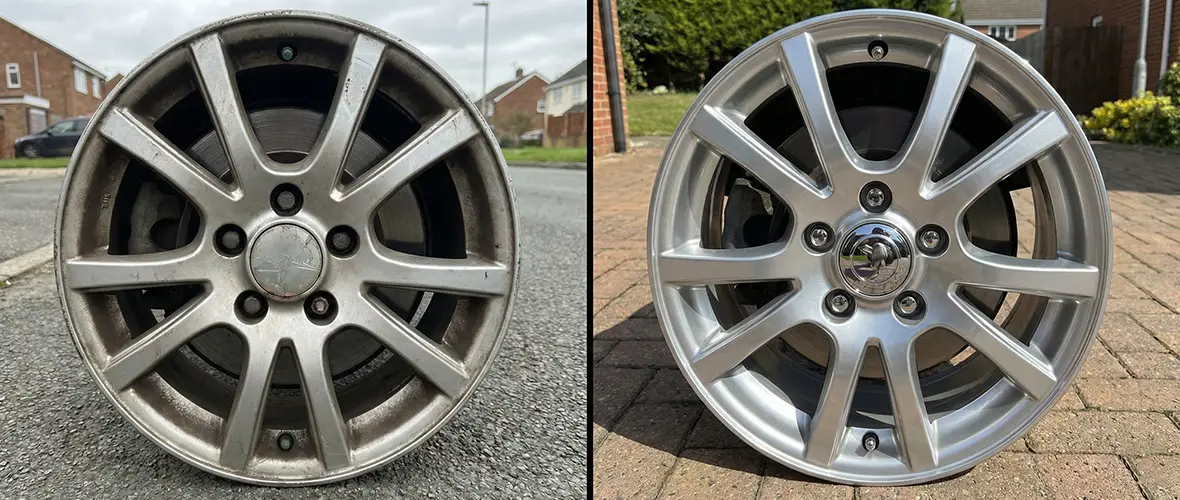
Alignment so it does not look cheap
A crooked logo ruins the whole thing, and it is an easy mistake. Your eye is weirdly sensitive to rotation, so even a small tilt looks wrong. I line the emblem up with a spoke or the valve stem, then I step back and look again. Once I like it, I press lightly first, then I press hard.
This is the routine I use so all four wheels match. I pick one “top” spoke for each wheel and treat it like my north star. I dry fit the emblem, then I rotate it until it looks level from a few steps away. Only then do I peel and commit.
Use a spoke or valve stem as a level reference
Step back and check from a few feet away
Press lightly first, then press hard once it is right
Best car upgrades under 50 dollars version
If you want the upgrade to look more complete, add two small details. First, clean the lug pockets so brake dust does not make a dark ring around your fresh center. Second, use matching valve caps so the wheel looks finished. These are tiny moves, but they change the “whole wheel” impression.
I call valve caps the cufflinks of the wheel, because they are small and they show you care. A missing cap makes the wheel look neglected, even if the rest is clean. Metal caps also feel better in your hand than cracked plastic ones. Just do not over tighten them, hand tight is enough.
If you want a direct product example of the metal cap style, this page shows the common features people look for. ATS Rim Valve Caps for Car Standard Fit It is the kind of small add on that makes the wheel feel intentional. Tighten them by hand only, because over tightening can damage the valve stem. When the centers are crisp and the caps match, the upgrade reads like a package.
For the emblem itself, I lean toward domed resin when the goal is that badge shine. This product page is a good example of the glossy domed style and the way it catches light. Domed emblem Luxury Edition High End Dome Labels Pick the right size and keep it level, and it looks like a new center cap from normal viewing distance. That is the whole point of the before and after.
Mistakes that waste your money
Most failures come from dirt, moisture, or impatience. People rush the cleaning, touch the surface after the alcohol wipe, and trap oils right under the adhesive. Then they wash the wheel right away and blast the edge with water like they are pressure washing concrete. The decal did not fail, the process failed.
Here are the mistakes I see the most, and they are all easy to avoid. If you fix these, your odds of a clean long lasting install go way up. You do not need perfect, you just need disciplined. And yes, it is annoying, but it is cheaper than doing it twice.
Installing over wax or tire shine mist
Applying on a damp cap, even slightly damp
Using a size that crosses onto a curve or bevel
Pressing for five seconds and calling it done
Washing hard in the first day, especially hitting the edge up close
My rule for pressing is simple, press longer than feels normal. I walk my thumb around the edge in a slow circle, then I hold a firm press over the whole emblem. Pressure sensitive adhesive needs pressure, that is why it is called that. Give it the pressure and it rewards you.
Keeping it looking good
Once it is installed, treat it like paint, not like a sticker you want to test. Normal soap and a soft brush are fine. Harsh chemicals and aggressive scrubbing are what make things look tired. If you use a pressure washer, do not aim the stream right at the edge from close range.
If you want a clear explanation of why prep and cure time matter, this post lays it out in plain language. What Are Wheel Emblem Stickers and How Do They Work? The cure time is the part people ignore, and then they act surprised when water finds the edge. I tell people to install in the evening, then leave the car alone overnight. Give it a calm day and it will hold up like it should.
Style rules so cheap does not look cheap
The fastest way to make this look bad is to mix styles like you are picking random candy. Pick one finish and repeat it across the wheel. If your wheels are black, a black or silver center usually looks clean. If your wheels are silver, a classic silver look usually works.
Here are three combos that almost always work, even on normal daily drivers. They look calm, planned, and close to factory style. That is the vibe most people want when they say “clean.” If you are unsure, copy one of these and you will not regret it. You can go louder, but clean gets more compliments.
Black emblem and black valve caps on dark wheels
Silver emblem and metal caps on silver wheels
One accent color that matches calipers or trim
By the end of this, you should have a wheel that reads “newer,” even if it is the same wheel. The center is crisp, the details are not sloppy, and the whole wheel looks finished. That is why I love this upgrade, it is quick, it is cheap, and it makes the car feel cared for again. If you do one wheel first and you like it, do the other three and take the photo, you will see the before and after right away.
FAQ
Q: Can a $20 wheel upgrade really change the look of my car?
Yes, because the center cap is the focal point, and a fresh logo changes the wheel’s face. Your brain reads the center first, then the spokes. Fix the center and the wheel looks sharper.
Q: What is the biggest reason wheel emblem stickers fall off?
Bad prep, usually oil or residue left on the cap. Wipe with isopropyl alcohol, let it dry, and do not touch the surface again before install. Press firmly and avoid washing for about a day.
Q: How do I know what size to buy?
Measure the flat visible logo area in millimeters, not the outer cap diameter. The emblem should sit fully on the flat pad and not cross onto a curve. When in doubt, follow the measuring guide linked above.
Q: Are wheel emblem stickers safe in automatic car washes?
Yes, if you installed them on a clean surface and gave the adhesive time to set. Avoid blasting the emblem edge with high pressure water from close range. Normal washes are fine when the edges are seated.


