


The Stories Behind Famous Car Logos (Mercedes, BMW, etc.)
Car logo history is way more interesting than people think, and it shows up every time you look at your wheel emblems.
In this post I am going to break down what the logos of Mercedes, BMW, Audi, Toyota and Ferrari actually mean, and how that tiny badge on your center caps quietly tells a story every time your car rolls past someone.
Why car logo history matters when it sits on your wheels
That little circle in the middle of your wheel is doing three things at once:
It shows which brand you drive
It tells a story about that brand’s roots
It says something about you and how much you care about detail
When you upgrade your center caps with clean, sharp emblems, you are not just “adding stickers”. You are putting the brand’s whole story back in focus instead of letting it fade and peel.
If you want the practical side of how these badges work on the wheel itself, read this first: What Are Wheel Emblem Stickers and How Do They Work?
Then come back here and see what the logos actually say.
Mercedes-Benz: a star that wanted to go everywhere
The three pointed star in the Mercedes logo is simple, but the meaning is strong.
Each point stands for a place where the company wanted its engines to dominate:
Land
Sea
Air
So when you see that star on a wheel center cap, it is not just “fancy luxury”. It is basically saying: “This brand builds engines for almost anything that moves.”
On your wheels, that star communicates:
Engineering focus: not just style, but serious hardware
Status: people instantly read “premium” the second they spot it
Heritage: this badge has been around for a long time, through a lot of models
If your Mercedes is still running around with faded or yellowed caps, you are telling the opposite story. Fresh star emblems on the wheels flip that back to “owned, loved, maintained”.
You can find star-style domed badges for all the major brands in Domed Emblems.
BMW: not a propeller, but still about the sky
Most people will tell you the BMW roundel is a spinning propeller. Nice story, but that is not the real base idea.
The blue and white quarters actually come from the Bavarian flag, where BMW started.
Two layers of meaning:
Bavaria colors → “We come from here”
Circle with letters BMW → strong, simple badge that works on anything
The propeller story started later because of an old ad where the logo sat inside an airplane propeller. The myth never died, and even BMW let it run because people liked it.
So what does that logo say on your wheel caps?
You care about precision and handling
You like heritage with a performance twist
You know this is not just a car, it is a driver’s car
If your BMW wheels have random cheap logos or blank caps, it feels off. Matched, glossy emblems in the correct size instantly bring the car back to “factory sharp”.
You can browse sizes and styles across brands in Wheel Emblems.
Audi: four rings, four roots
The four rings on an Audi badge come from Auto Union, a group of four companies that joined forces:
Audi
Horch
DKW
Wanderer
The rings were designed to show unity between those brands. Later on, they became the face of what we now know as Audi: clean, technical, premium.
So when those rings sit in the center of your wheels, they quietly say:
“This car comes from a long line of joined engineering efforts.”
“We are serious about design and structure.”
Today Audi plays with logo styling for new markets and electric cars, including cleaner, flatter versions and name-based badges for some models, but the four rings still signal that same heritage and high-end feel when they appear on your center caps.
If you are running nice Audi alloys with blank centers, you are leaving free real estate unused. Drop the four-ring style emblems on there and the whole side view instantly looks more complete.
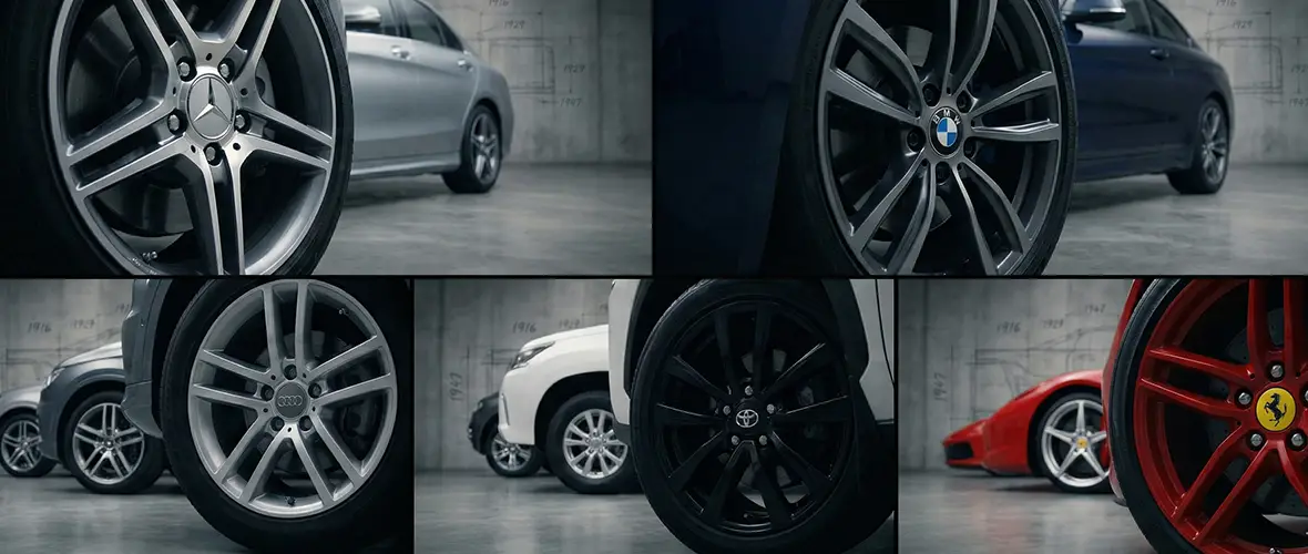
Toyota: three ovals and a hidden “T”
The Toyota badge looks like a simple oval, but it is designed with layers.
The logo uses three overlapping ovals:
Two inner ovals form a stylized “T” and also show the heart of the customer and the heart of the company crossing each other
The outer oval surrounds them and represents Toyota’s reach and presence across the planet
So on your wheel caps, that symbol is saying:
“Customer and company are aligned.”
“This car is built on trust and reliability.”
“This badge stands on more than just price.”
When you run clean Toyota hubcap stickers on a basic Camry, Corolla or RAV4, the car stops looking “generic silver sedan” and starts looking like a car that someone still cares about.
If you want a deep dive in that direction, check out
Enhance Your Toyota’s Style with Custom Hubcap Stickers
Ferrari: the prancing horse and a fighter pilot
The Ferrari prancing horse is pure attitude, but it started in a very real story.
Quick version:
Italian fighter ace Francesco Baracca used a prancing horse on his plane in the First World War
After his death, his parents suggested Enzo Ferrari use the horse as a good luck symbol
Ferrari added a yellow shield (color of Modena, his home city) and the Italian flag colors at the top
That is how you got the classic badge you see today.
On a steering wheel or hood it screams speed and racing.On center caps it does one extra thing: it connects your car to decades of racing history some people only ever see on TV.
If you run Ferrari style badges on your wheel centers, you are not just “showing off a logo”. You are saying “I care about motorsport and heritage, even in the tiny details”.
How this ties back to your hubcap stickers
Here is the simple truth: the logo on your wheel caps is doing the heavy lifting for your car’s identity.
A fresh, accurate emblem says you care about the car
A crooked, wrong color or terrible print kills the entire vibe
A blank cap looks like you stopped halfway through a build
That is why I always tell people: If you do only one visual upgrade on your car, start with the center caps.
You can:
Pick flat or 3D domed badges matched to your brand in Wheel Emblems.
Go for deep, glossy badges for the big names in Domed Emblems.
If you want help spotting quality, this post will save you from junk: Quality Matters: How to Spot High-Quality Wheel Emblem Stickers
Quick FAQ: stories behind car logos
What is the meaning of the Mercedes logo?
The Mercedes three pointed star stands for engines on land, sea and air. So when you run clean Mercedes style emblems on your wheels, you are carrying that original “everywhere” vision in a tiny metal or resin badge.
Is the BMW logo really a propeller?
No, the core meaning is the blue and white colors of Bavaria, where BMW is from. The propeller idea came later from old ads, and the myth stuck, but the base design is about the brand’s home region first.
What do the four rings on the Audi logo stand for?
The rings show the union of four companies: Audi, Horch, DKW and Wanderer. Each ring is one brand, and together they created Auto Union, which later led to the Audi badge we still know today.
What is the meaning of the Toyota logo?
The Toyota badge uses three ovals. Two inside ovals show the bond between customer and company, and together they form a “T”. The big outer oval wraps them and represents Toyota’s reach and presence across markets.
Why should I care about car logo history if I just want my car to look better?
Because when you know the story, you stop treating emblems like random stickers. You start picking correct sizes, clean designs and better quality, so your wheels tell a clear story instead of a cheap one. That is how you get a car that looks intentional, even on a small budget.
Which upgrade gives me the biggest visual change for the least money?
In most cases: wheel emblems and hubcap stickers. You see them every time you glance at the side of the car, they are easy to install, and they cost a fraction of new rims. Start there, then build out with valve caps and other small accessories.
If you want your car to carry these stories the right way, start with fresh, accurate center cap badges that actually respect the logo they show.
Your wheels are speaking anyway. Make sure they are saying the right thing.


